Play Tennis
DESIGN SYSTEM | MOTION DESIGN
Re-designing the Play Tennis site involved creating a new design system. Colours, fonts and imagery were changed and curated for the new Play Tennis website. This involved working with Play Tennis brand guidelines whilst making sure the site remained AAA accessible.
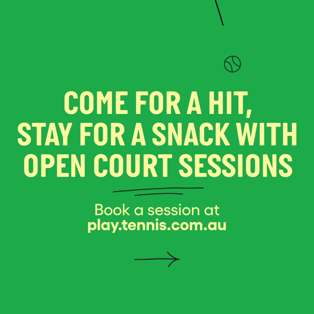
During the rebrand process, I was also able to create a number of digital assets with fun tennis-y animations for launch.
The Challenge
Outdated Design
The existing Play Tennis website lacked visual appeal and did not align with the updated brand identity.
No Design System
There was no centralised design system, leading to inconsistencies across pages.
Accessibility Standards
The site needed to meet AAA accessibility requirements to ensure inclusivity for all users.
Limited Engagement
The lack of dynamic elements made the site feel static and less engaging.
The Solution
We reimagined the Play Tennis site with a modern design system, refreshed branding, and dynamic digital assets to create a consistent, accessible, and engaging user experience.
The Benefits
Enhanced Brand Alignment
The refreshed design fully reflects Play Tennis’s brand identity while adhering to accessibility standards.
Improved Consistency
The newly developed design system ensures uniformity across pages and future updates.
Accessibility Compliance
Meeting AAA accessibility standards makes the site inclusive for all users.
Scalability
A documented design system allows for easy updates and future expansions.

The Approach
Accessibility Compliance
Ensured all design decisions—such as color contrast, text hierarchy, and layout—met AAA accessibility requirements.
Documenting the System
Developed a comprehensive design system, including:
Components: Standardized buttons, cards, and navigation elements for easy reuse.
Guidelines: Instructions for using fonts, colors, animations, and imagery.
Launch Support
Collaborated with the development team to implement the new designs seamlessly.
Re-Designing the Site Structure
Audited the existing site to identify areas for layout, usability, and visual design improvement.
Creating a New Design System
Colors: Curated a vibrant palette that aligns with Play Tennis brand guidelines and meets AAA accessibility standards.
Typography: Standardised fonts for consistent use across headings, body text, and UI elements.
Imagery: Introduced dynamic, curated visuals to capture the energy and excitement of tennis.

The Outcome
A visually appealing and cohesive website that reflects Play Tennis’s refreshed brand identity.
Enhanced user experience through accessible, vibrant, and functional design.
Increased engagement thanks to playful animations and dynamic digital assets.
Long-term scalability with a documented design system for future updates and campaigns.
Positive feedback from users, reinforcing the success of the redesign and rebrand efforts.