UpGuard
UI DESIGN
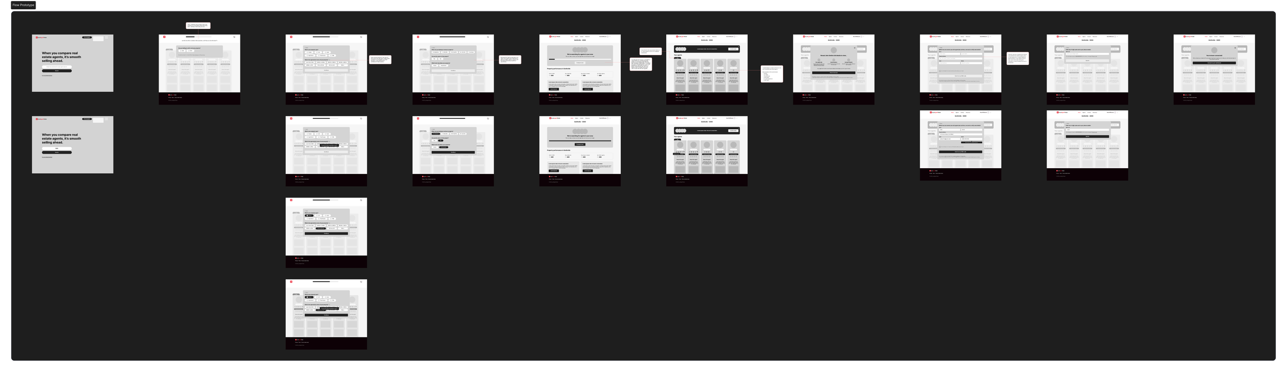
UpGuard sought to launch a flagship product campaign for Vendor Risk, using it as a catalyst to refresh and modernise their overall brand identity. This project challenged me to design a landing page that not only effectively marketed the product but also served as a new beacon for the UpGuard visual brand, pushing it towards a more innovative and memorable future.
The Challenge
Dual Objective
The design needed to simultaneously promote the Vendor Risk product and embody a significant evolution of the UpGuard master brand.
Establishing Trust in Cybersecurity
The visual identity must remain professional and trustworthy while adopting more modern, human centred design trends.
Creating a Cohesive System
The new direction required a scalable design system with refined components, like a card based layout, that could be applied across other marketing channels.
Balancing Innovation with Alignment
While encouraged to be innovative, the solution still needed to feel like a logical and elevated progression from the existing UpGuard brand.
The Solution
I designed a modern, responsive landing page that introduced a brighter, more human centric visual language to the UpGuard brand. The solution used a refined colour palette, bold typography, and a structured card based layout to enhance usability and present complex cybersecurity information with clarity and confidence.
The Benefits
A Modernised Brand Identity
The refresh positions UpGuard as both a trusted leader and a forward thinking innovator in the cybersecurity space.
Improved User Engagement
A clear, intuitive layout with scannable content sections reduces cognitive load and improves information retention for users.
A Scalable Design System|
The introduced components, such as cards and a refined typographic hierarchy, create a flexible system for future marketing campaigns and web pages.
Cross Device Consistency
A fully responsive design ensures a seamless and professional brand experience for all users, regardless of their device.

The Approach
My process was centred on modernising the brand while strengthening its core message of trust and simplicity in cybersecurity.
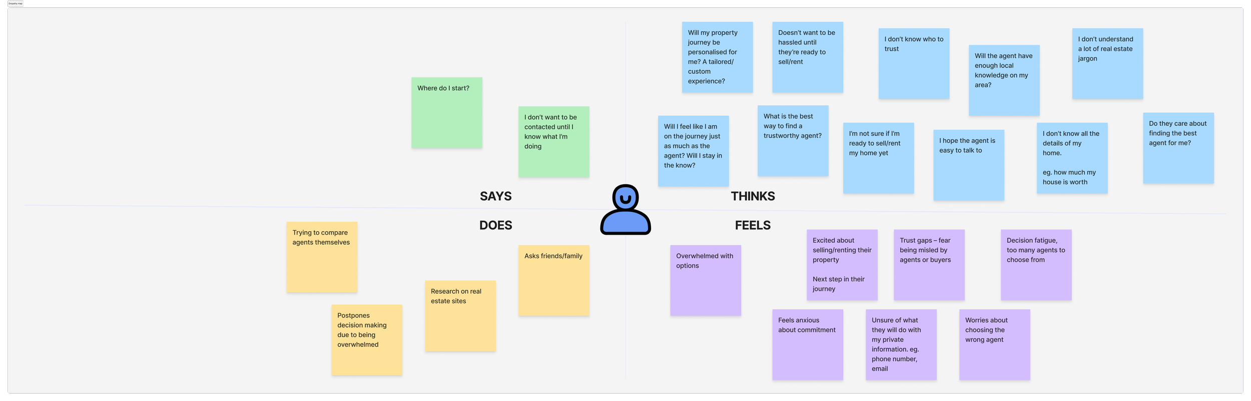
Market Discovery and Trend Analysis: I began by researching modern B2B design trends, identifying a movement towards humanistic elements that build deeper connection without sacrificing professionalism.
Audit of Existing Brand Assets: I analysed the current UpGuard visual identity to identify key elements to retain, such as core brand colours, and areas for evolution, like typographic hierarchy and visual spacing.
Component Led Design
I structured the page using a card based layout to logically group complex information. This approach enhanced scannability and created a modular system for future use.
Responsive First Mindset
I designed the layout with a mobile first approach, ensuring all components and imagery would adapt gracefully to provide an optimal experience on any screen size.
The Outcome
The final deliverable was a high fidelity prototype for a responsive landing page that successfully met both campaign and brand objectives. The design introduced a more open, airy, and confident visual language through:
A refined colour palette that felt brighter and more contemporary while maintaining brand recognition.
Bold, confident typography using Inter to improve content hierarchy and readability.
A structured, card based layout that organised information into digestible sections, significantly enhancing usability.
A human centric aesthetic that made the topic of cybersecurity feel more approachable and relatable.
This project successfully demonstrated how a product campaign can be leveraged to advance a master brand, resulting in a modern, trustworthy, and user friendly experience that aligns with UpGuard's innovative vision.